How TLBM designed a user journey, not just a website, for a partner-manager at a payment solutions company
About the client
Dominic Toller is an independent business consultant and partner manager with Dojo, a London-based payment processing solutions provider. With a strong focus on the hospitality and retail sectors, he has helped numerous businesses improve their payment processing systems, deliver better customer service, and grow their operations.
Client
Hospitality and Retail Payments Solutions
FinTech
Four weeks
Client’s goal
To build a parallax website named 'Hospitality & Retail Payment Solutions' that engages visitors through animations, guiding them from the top of the page to the bottom, while showcasing the diverse functionalities of the payment solutions and aiding in sales
The challenge
While line animation seems simple, its actualisation was far from it. The challenge was to make it an integrated part of the website’s overall design and copy. It needed to be more than just a moving graphic; it had to carry the essence of the complex solution offerings, weaving itself naturally into the website layout.
The second challenge was ensuring that this line animation was responsive, delivering a uniform user experience across various devices—a desktop, a mobile phone, or a tablet. This required rigorous testing and design alterations to ensure the animation’s seamless functionality across different screen sizes.
Skills applied
- Information Architecture (IA)
- Visual storytelling with animations
- Custom WordPress development
- UI/UX & prototyping
- Website design
- Copywriting
The TLBM approach
Building a narrative with textual elements
We developed a content blueprint tailored for the parallax site to ensure comprehensive coverage of the client’s requirements.
Our copywriters transformed the complexities of the payment solutions offerings into digestible and engaging content. They meticulously detailed each feature and functionality, highlighting the benefits to make it compelling for visitors.
The copy was approved for design after a single round of edits. Complementing the visual animations, particularly the guiding “line animation,” the content served as an intellectual and emotional counterpart to the website’s overall look and feel.
02
Designing interactivity
The next step was to create a basic outline of the website’s structure and draw wireframes, which helped us plan where all the animations would go on the parallax website.
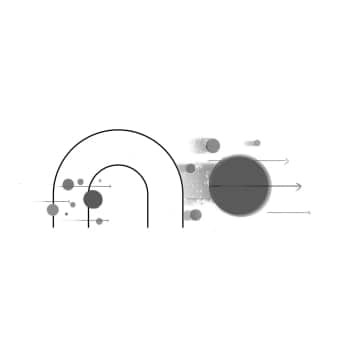
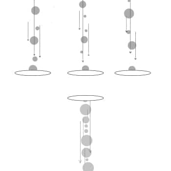
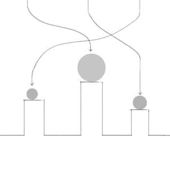
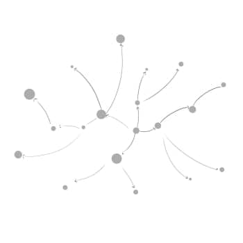
These animations were not just visually stimulating; they were storytelling elements that brought the product features to life in an engaging, interactive manner.
Each section of the website features playful animations with moving parts. These are designed to catch the visitor’s eye and educate them about what’s being offered in a fun and engaging way.
In addition, we evaluated the latest web development frameworks and UX/UI methodologies for creating an optimal user experience across all devices.




03
Ensuring website quality
The final stage of our approach centred on rigorous testing to ensure the website’s responsiveness across various devices, from desktops to tablets and mobile phones.
We also ran user experience tests to validate the effectiveness of the animations and textual elements in creating an engaging, interactive, and educational user journey.
After confirming that all elements aligned with our quality benchmarks and receiving client approval, we deployed the website, turning the client’s vision into a digital reality.

Anshal Patel
Head of Design, TLBM
“In this project, our groundbreaking innovation was perhaps the incorporation of line animation. As soon as you land on the website, this line serves as a visual guide, inviting you to follow it through the journey the page has to offer. More than just a graphical element, the line fosters intrigue and curiosity, encouraging visitors to explore each section step-by-step. We wanted this feature to significantly impact how users interact with the site, effectively reducing erratic jumping between sections.”
Technical challenges averted
Responsiveness across devices
Challenge
Ensuring the line animation works seamlessly on various screen sizes, from large desktop monitors to small mobile screens.
Solution
We used CSS media queries and SVG scaling to ensure the line animation adapted to different screen dimensions. This required iterative testing to ensure the user experience remained consistent across all devices.
Browser compatibility
Challenge
Ensuring that the animation performs well on different web browsers, such as Chrome, Firefox, and Safari.
Solution
We employed feature detection and polyfills to ensure the animation endered consistently. This ensures visitors can experience the website’s full functionality regardless of their browser.
Page load time
Challenge
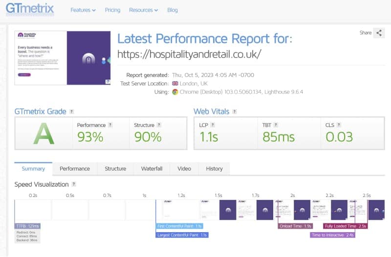
Integrating high-quality animations without affecting the website’s loading speed, a key factor in user engagement.
Solution
We optimised the animation using JSON formats and used lazy-loading techniques to ensure they did not hinder the page’s loading time. As a result, the website maintains an average load time well below the industry standard of three seconds.
Tools we used for the job

“Working with the team has been an extraordinary experience. The end result wasn’t just a website that looked good; it provided an intuitive, brilliant, and immersive user experience that met all of my strategic objectives. It’s truly a testament to TLBM’s expertise and commitment to quality.”
Every website has a story to tell
We help deliver those stories through our high-impact web designs and intuitive and responsive interfaces. Want to see how we can help you? Contact us.