Gone are the days when a business website was only about contact information and a fancy logo. Today, it is the place where most people first interact with your business. Whether it is to learn about your services, make a purchase or read a blog post – your website design and content must serve your visitor’s needs.
However, if its navigation is confusing or the layout is chaotic, the work you put into writing copy for the website could go to waste. The thing is, a strategically-designed website with excellent user experience can be a consistent source of marketing leads for you without requiring much extra effort.
Here are seven basic website design best practices that play a crucial role in your inbound marketing efforts and for your online presence:

1. Earlier appearance in the buying cycle
Today’s buyers no longer wander into a shop or call up a sales executive with no idea of what they want. They conduct research online about the kinds of products or services out there and the deals they can get.
This means that by the time they visit your website, they may already know what they want and be evaluating multiple seller options. By having an inbound-focused responsive design for your website, you can be present for your customer through every stage of the buying process, starting from the awareness stage when your customer first recognises what they need and why.
Your website content also plays a significant role in user experience and thus helps the customer understand what it is that they need, explain why your offerings are the best way to address this need, and then enable them to reach out to your team over email, calls or a chat service. This will place you head and shoulders above businesses who just put a ‘Contact Us’ page on their website.

2. Dynamic personalisation
A key element of inbound marketing is dynamic personalisation. This involves using behavioural and demographic information to create custom content for a site visitor to view. Dynamic personalisation helps the website design team to make strategic decisions about what role each element on a webpage plays.
The personalisation process should happen at the back-end of the website and move with the natural flow of the visitor’s browsing journey. For instance, a banner that displays their ‘recently viewed items’ or ‘previously read blogs’ as they browse through your product catalogue or blog dashboard is a form of dynamic personalisation.
This kind of in-built personalisation incites your visitors to stay longer on your website and also saves your designers time as they do not need to keep tweaking the website design.
No wonder, businesses are now investing resources in developing a rigorous social media presence, all for the sake of interacting with their respective target customers spread in the digital realm. Leveraging social media for boosting customer satisfaction will be a priority.
3. Implement site page essentials
A common practice is to include several of these must-have elements on the website:
- A short, easy-to-read headline to communicate the overall message of the page and instantly hook the visitor’s attention
- A hero visual (could be a static image or video) that provides a context to your headline and to impress the visitor when they land on your page
- A navigation bar is a critical site-wide element as it directs visitors through the pages so that they can learn about the company and its offerings.
- Customer reviews, awards, and affiliations give social proof to the visitors and increase the credibility of the business.
- A footer to display relevant site links, social media and contact information so that visitors can connect easily
4. Clear calls-to-action
Calls-to-action (CTAs) are integral parts of the inbound marketing effort. Your CTAs are what will drive conversions and boost the number of visitors your site gets.
CTAs should have concise but appealing text and be positioned prominently on the webpage, preferably higher up so that the visitor does not have to scroll down to find them. Examples include “Request a callback,” “Sign up for a consultation,” and “Start free trial.”
They should also have eye-catching colours and imagery without being too overwhelming. It is also essential to position CTAs strategically with the rest of your site content to be in sync with the buyer’s decision-making journey.

5. Using a content optimisation system
Website design today is about much more than a beautiful layout and some catchy ‘About Us’ copy. A content optimisation system (COS) that integrates with your inbound marketing efforts can help you customise website content based on the kind of visitor viewing your website and also suggest keywords you can incorporate to boost your search engine rankings. Hubspot, for instance, has an excellent COS.
6. Performance metrics
It is essential to have a platform in place to track the metrics most relevant to your business and make quick changes to your website as needed. Some of the critical metrics for inbound marketing include search engine traffic, bounce rate and referral traffic from social media and email marketing.
Your platform should allow you to quickly A/B test new elements, such as a landing page or a CTA so that you can implement whatever is necessary to keep your customers on your user-friendly website for longer and have a higher potential to convert them.
7. Costs that yield valuable ROI
Many businesses hesitate to invest in the professional website redesigning for inbound marketing, preferring instead to do periodic redesigns that are more aesthetics-focused. However, this leaves out the lead generation and conversion aspect of the website, is more costly overall and leaves the site stagnant between redesigns.
A better option is to invest incrementally in website design and development changes based on reports on how different aspects of it are performing.
We at TLBM do that for our website and also our clients’ websites. This not only keeps the sites up-to-date with the latest trends but also allows us to justify the ROI of each aspect of the website upgrade and thus prove that the monetary investment is worth it.
If your website currently has a poor conversion rate and more bounce offs, now might be the right time to review the usability of your website. The process sounds unnerving, indeed, which is why we can do a quick
website audit for you for free if that interests you.
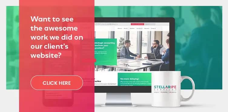
If you want us to create a professional website from scratch, we can deliver that too! Here is what we did for one of our clients, Stellaripe. Let us launch an incredibly high-quality, result-oriented website for you today!


