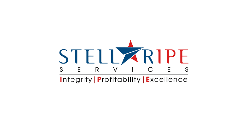
How TLBM helped refresh Stellaripe’s logo to show a more professional brand without completely overhauling the original one
Founded in 2018, Stellaripe is a specialist provider of timely and professional accountancy services in the UK.
Client
Stellaripe Services
Industry
Accounting
Goal achieved in
Two weeks
The brief
- The company’s brief included the requirement for a brand logo and colours, preferably in the shades of red and green.
- The company brands itself as an “extended team” of accountancy practices and so the logo needed to be able to encompass that they are professional and reliable.
The challenge
There are a large number of players in the market with a range of logos, so care was needed to make it memorable.
Skills applied
- Creative thinking
- Simplicity and minimalism
- Colour theory
- Typography
TLBM Solution
- The team started by researching the logos of the market incumbents to ensure what they were proposing would stand out and be memorable.
- They proposed a textual graphic which is capable of working across multiple domains and formats in the accounting industry.
- The logo portrays a professional and sophisticated image of the company with crisp colours and bold font.
- They refined the ‘A’ in Stellaripe to make the star vector inside it look more distinctive.
Proposed variations
Outcome
A classy logo that the company is delighted with and which was delivered within the given timescale.
OLD

NEW
Businesses that tell great stories always pull big crowds
Want to see how we can help you? Get in touch with us.