How TLBM rebranded a green technology service provider’s website with three different offerings and boosted the organic search traffic by 80%!
About the client
A leading green technology services provider, Waste2ES specialises in cost-effective, labour-efficient, user-friendly food waste management solutions. They had added Simpro’s top-tier bin lifting and tipping equipment to their portfolio the year before and were now looking to complement their waste solutions with bio-augmented treatments by Biowish, underscoring a commitment to environmental wellness.
Client
Waste 2 Environmental Systems
Green technology
Three months
Client’s goal
To seamlessly unify the offerings of Waste2ES, Simpro, and Biowish on a single platform as a united product portfolio, while distinctly highlighting each offering’s unique specifications, use cases, and functionalities.
The challenge
Waste2ES originally focused solely on food waste systems. However, their collaborations with Simpro and Biowish introduced bin lifting and water treatment solutions to their offerings. These distinct services shared a unified purpose-environmental sustainability and care for us and our planet. Our challenge was twofold:
- Meld the distinct ethos of each offering into a cohesive brand narrative without diluting their unique characteristics.
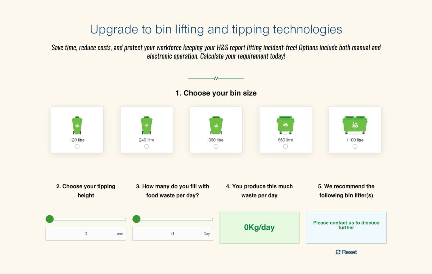
- Design specialised product pages for Simpro and Biowish to detail their products and specifications. Additionally, for Simpro, we were tasked with creating a bin-lifting capacity calculator to guide users in choosing appropriate waste collection solutions.
Skills applied
- Custom PHP development (for calculators)
- Custom WordPress development
- Information Architecture (IA)
- UI/UX & prototyping
- Branding strategy
- Website design
- Copywriting
The TLBM approach
Homepage blueprint development
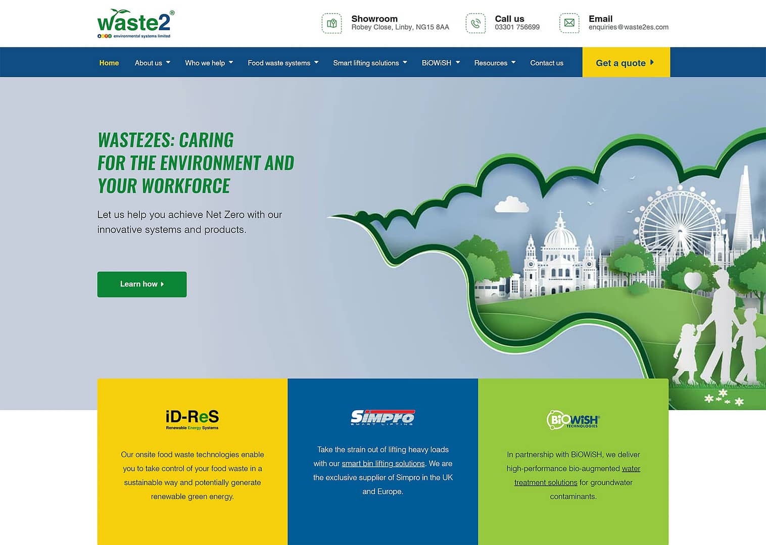
Our initial move was to outline a clear content strategy for the company and to design that into the homepage. We emphasised Waste2ES’ three unique offerings, all championing the cause of environmental stability and human well-being.
Here is what we did:
- Added separate segments for Simpro and Biowish, showcasing the range of bin lifters and water treatment solutions, with direct links to their detailed pages
- Positioned Waste2ES centre stage on the homepage to reflect its core identity
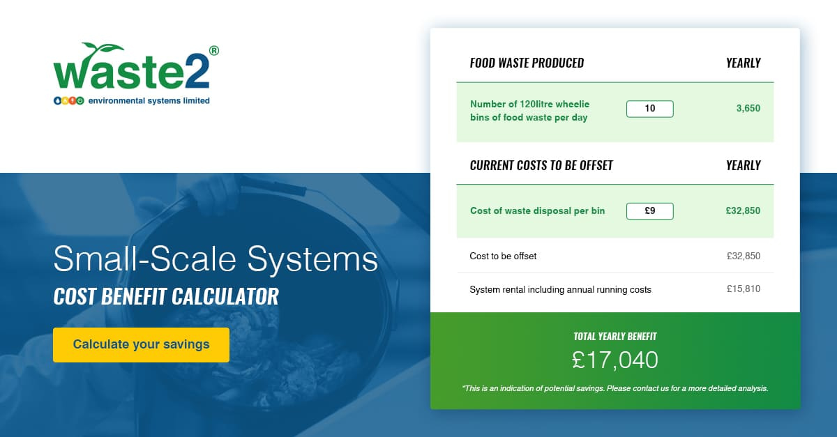
- Retained the previously designed food waste calculator for user convenience
02
Refining the “About Us” section
After finalising the homepage, our understanding of the brand deepened, prompting refinements to the website’s other sections.
We next focused on the “About Us” section, encompassing the “Our Story,” “Meet the Team,” and “Why Waste2ES” pages.
The key changes included:
- Moving beyond just promoting food waste management to emphasising a holistic commitment to environmental and human well-being
- Incorporating themes of emission reduction, strict adherence to 'zero waste to landfill' policies, dedication to workplace safety, and wastewater treatment solutions
03
Crafting user-centric product dashboards
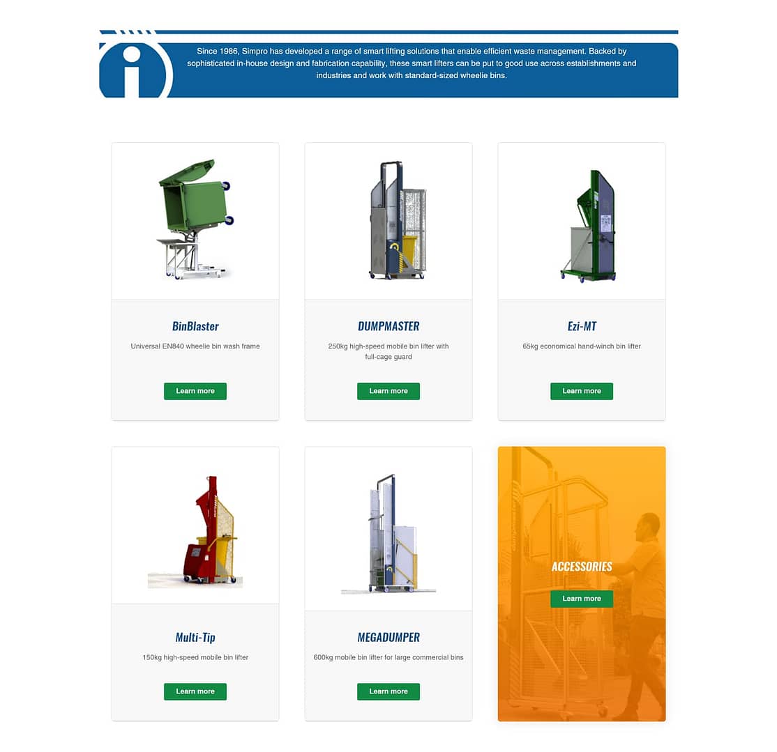
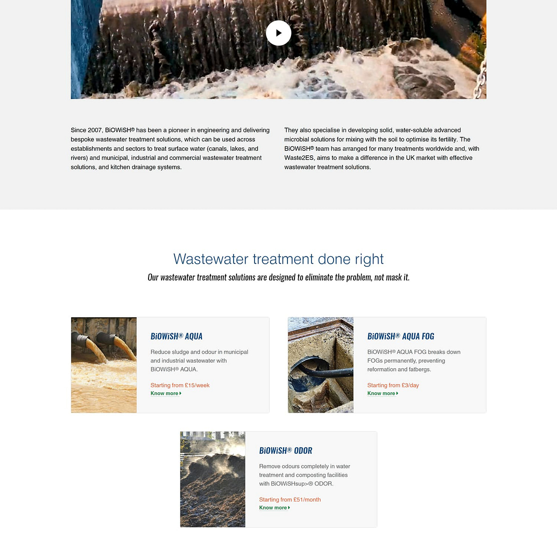
For both Simpro and Biowish, we developed:
- Dedicated dashboards: Each brand received its product dashboard, carefully designed to address common queries while preserving its unique brand essence.
- Enhanced credibility: We added videos, testimonials, and FAQs to deepen understanding and reinforce the brands’ trustworthiness within the Waste2ES framework.
- Unified branding palette: While Waste2ES primarily uses green and blue, we easily incorporated Simpro’s blue and Biowish’s green, ensuring a cohesive visual experience across offerings.
04
Streamlining product pages for Simpro and Biowish
While crafting the product pages for Simpro and Biowish, we aimed for the functionality of an eCommerce site without strictly following its design:
- Interactive layout: This approach enabled visitors to inquire, understand product specifications, and grasp the relationship between Simpro, Biowish, and Waste2ES, guiding them towards informed decisions.
- Comprehensive content: Each product page balanced detailed product information with a broader usage context, catering to diverse visitor needs.
- Trust-building elements: We strategically interspersed testimonials to highlight real-world benefits, amplifying the credibility of the solutions.
- Visual engagement: To enhance user engagement, we incorporated GIFs and videos, providing a dynamic view of product functionalities.
05
Deploying interactive user tools
Once the content took shape, our focus shifted to structuring the website. Leveraging wireframes, we mapped out a user-centric layout, ensuring an intuitive journey for all visitors.
We enhanced user engagement and efficiency with two primary tools:
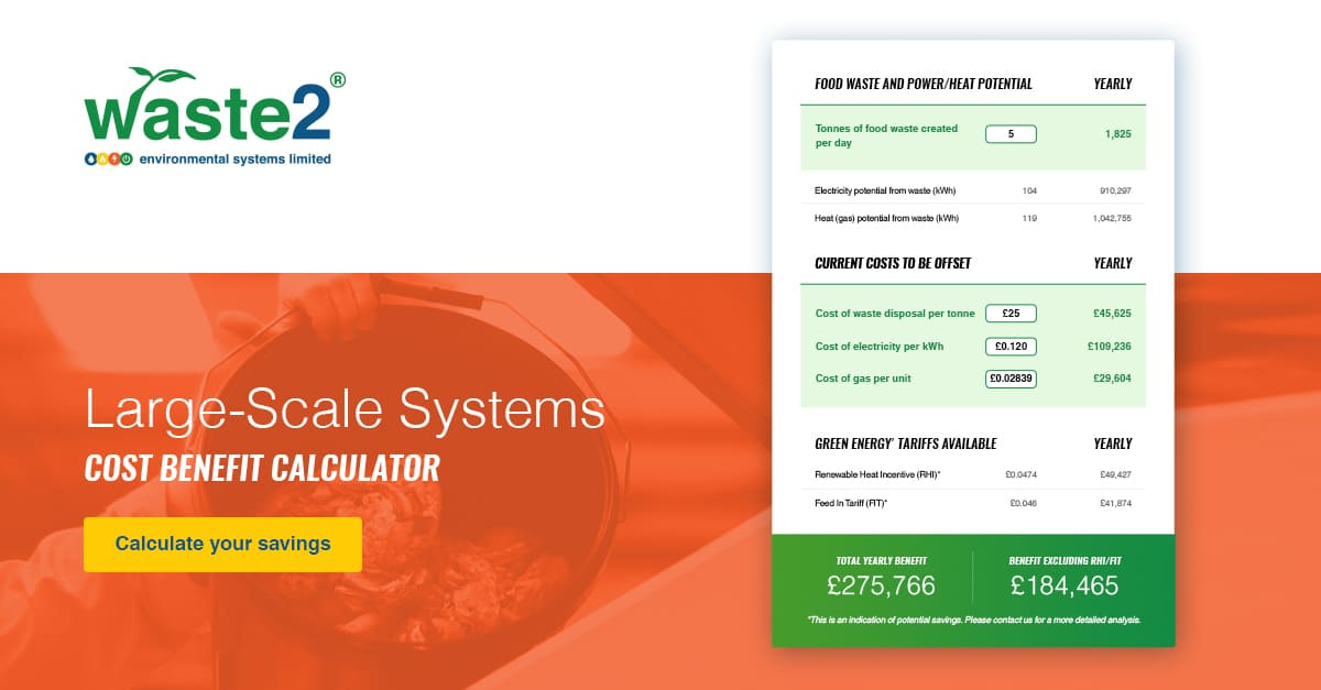
- A cost-benefit calculator, tailored for both small and large Waste2ES systems. This tool empowers users to gauge their existing energy consumption and juxtapose it with the potential energy yield from their food waste. The resulting insights illuminate potential savings.
- A bin lifting capacity calculator, designed to assist users in identifying the most suitable bin lifter for their business needs. This calculator has proven to be an invaluable tool in promoting Simpro products.
06
Setting web development standards for the Waste2ES brand
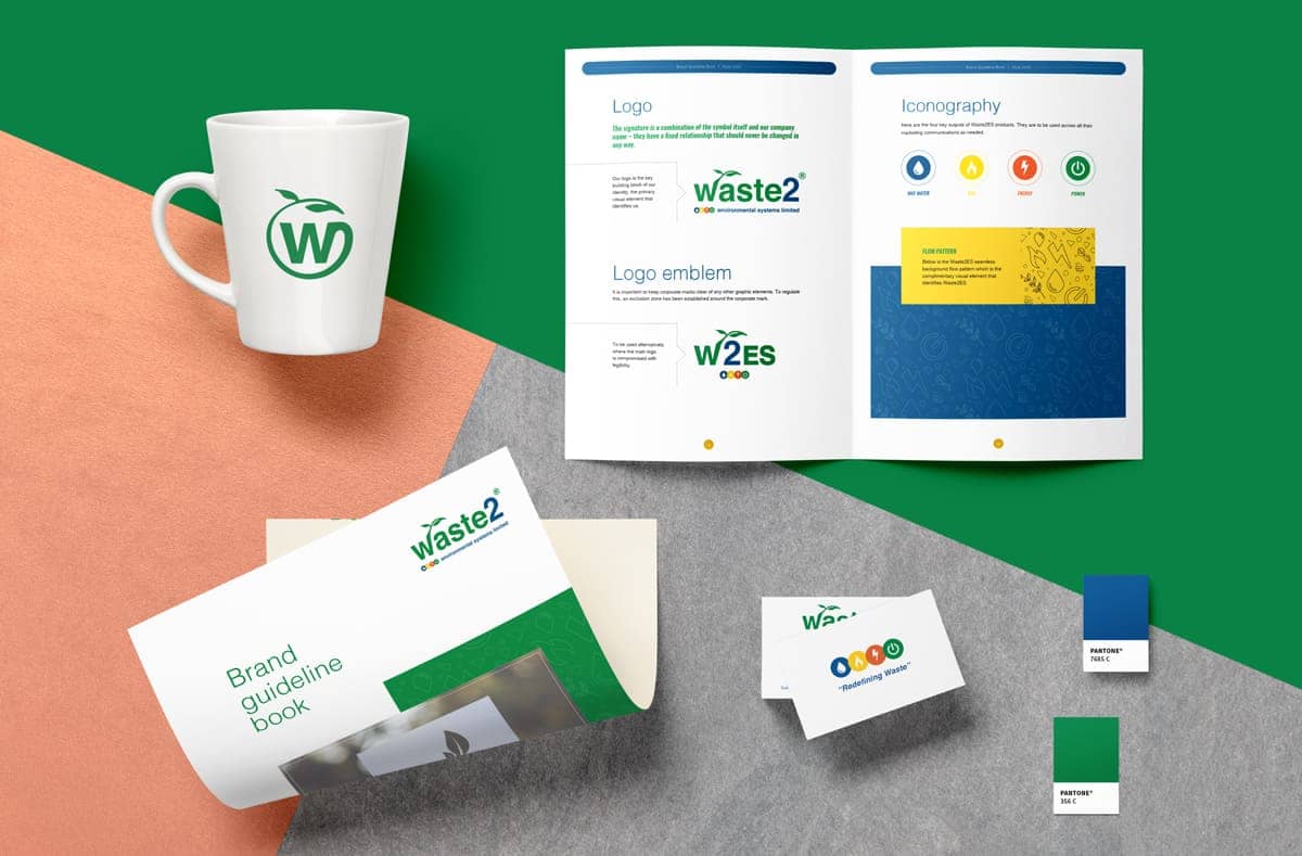
Following the design overhaul, our next step was curating a Brand Manual for Waste2ES’ revamped identity. This guidebook emphasised maintaining a unified brand presence across the website.
A typographic hierarchy took precedence in our approach. By strategically calibrating font sizes and optimising brand colour combinations, we ensured that the website’s content was engaging and easily digestible, boosting aesthetics and user-friendly navigation.

Anshal Patel
Head of Design, TLBM
“Designing and developing the website for Waste2ES was an exciting project for the team! We built a digital asset that is interactive, echoes the brand’s commitment to environmental stability, and promotes advanced green technology solutions. The challenge was to weave disparate technological elements into one cohesive narrative, presenting Simpro and Biowish under the Waste2ES umbrella, each retaining its individuality yet harmonising with the overarching theme of eco-conscious development. The success of this project lies in our ability to create a user-centric experience, blending intuitive design with cutting-edge technology, to bring Waste2ES’ vision to life.”
Technical challenges averted
Enhancing user comprehension of technical content
Challenge
Ensuring current and prospective clients can easily navigate and comprehend the different offerings and their functionalities.
Solution
By establishing a clear information hierarchy combined with interactive visual aids and accessible descriptions, we made complex concepts more digestible. Additional aids like tooltips, explanatory videos, and FAQs further assisted users in decoding intricate technological notions.
Responsiveness across devices
Challenge
Ensuring the videos, GIFs, and calculators work seamlessly on various screen sizes, from large desktop monitors to small mobile screens.
Solution
By leveraging CSS media queries coupled with SVG scaling, we ensured adaptability to varied screen dimensions. Iterative testing was crucial in preserving a uniform user experience across devices.
The results
80% traffic increase
Waste2ES now boasts a digital platform that resonates with its core business values, enhanced by modern site features and a rejuvenated design. Since the relaunch, the organic search traffic has surged by 80.
30% page view increase
Navigating the system pages has been simplified, leading to a 30% increase in page views, enabling existing and potential clients to comprehend the underlying technology easily.
20% session increase
The average duration of website sessions has increased by 20%, aligning with industry benchmarks and demonstrating the site’s engaging and user-centric design.
Tools we used for the job

“Building a cohesive brand that ties three different offerings under a single roof is not easy, but Kaz and her team made it look simple. We storyboarded our plan, and they helped us create a brand, a web presence and visibility in our domain—complete with two fantastic cost-benefit and bin-lifting capacity calculators for our target audience. We now have a website that reflects thought authorship and is an efficient marketplace for our customers!”
- Richard Harland, Former Managing Director, Waste2ES
Every website has a story to tell
We help deliver those stories through our high-impact web designs and intuitive and responsive interfaces. Want to see how we can help you? Get in touch.
